Begin with the End in Mind
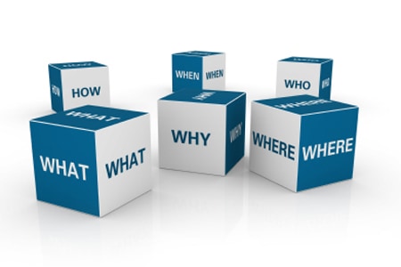
Before designing your booth display, ask yourself the following questions:
- How many staff will be in my booth?
- What are our goals for exhibiting? What do we expect to get out of the event?
- What product or service will we be showcasing?
- Who are our targeted buyers?
- What are my competitors’ displays like?
- Will we be conducting private meetings in our booth?
- What is the corporate image we want to project?
- What electrical, telecommunications and other services do we need?
Design Tips
- The Exhibitor Service Manual contains your show’s carpet and drape colors, floor plans, facility rules, and display regulations.
- Consider building a second story on your island booth. Second story’s are often reserved for private meeting rooms or food service areas within an island booth.
- Considering “spanning the aisle”. If you purchase booths that face each other across an aisle, purchase carpet in the aisle in the same color as your booth carpet to give the impression of one, incredibly large unified booth. Or, purchase a sign, banner or archway to span the aisle from the top of one booth to the top of the booth across the aisle (size restrictions may apply, so be sure to consult show management).
- Considering maximizing your branding by purchasing signage to hang above your booth, or elsewhere in the exhibit hall (size restrictions may apply so be sure to consult show management).
Graphics With Stopping Power
You have three seconds to grab buyers’ attention as they walk down the aisle. To make sure your display is noticed, design your graphics so they are visible from 30 feet. And make sure the design quickly and clearly tells buyers why they will benefit from coming into your booth. Your graphics must answer these buyer questions:
- Who are you?
- What is your product?
- What is your offer, and why should I care?
- Ensure your graphics have been professionally designed and then add back-lighting to make them “pop.”
Choose Colors that Sell
Color is a powerful psychological trigger. It creates strong emotions that can sometimes mean the difference between losing or making that sale. Here are the associations people make with certain colors.
- REDS: love, warmth, excitement, passion, and food.
- BLUES: power professionalism, trustworthiness, and calmness.
- GREENS: nature, life, and money.
- ORANGES: affordability, creativity, fun, youth.
- PURPLES: royalty, luxurious, fantasy, and dreams.
Each color has negative and positive associations with them so you should use colors in your designs in a way that steers the mind of the viewer towards the positive associations rather than the negative ones.
#BUILDBRANDFOCUS